Green means buy. Red means sell. Near zero means sit out. That's the whole interface. One score per market, built from the data the big funds trade on.
Each engine watches a different corner of the market. Together they become one score per pair.
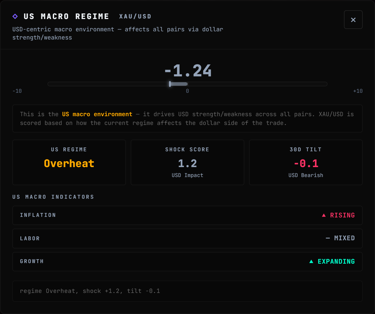
MacroLIVE
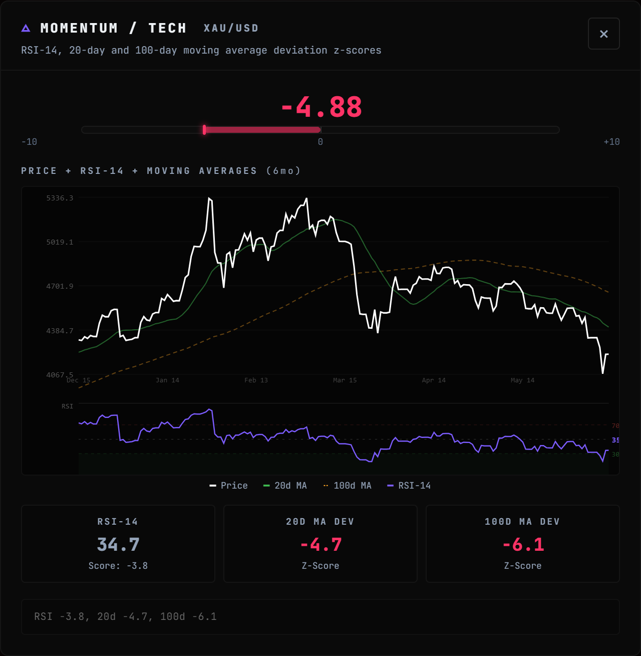
CPI, jobs, GDP. Scored the second they drop.
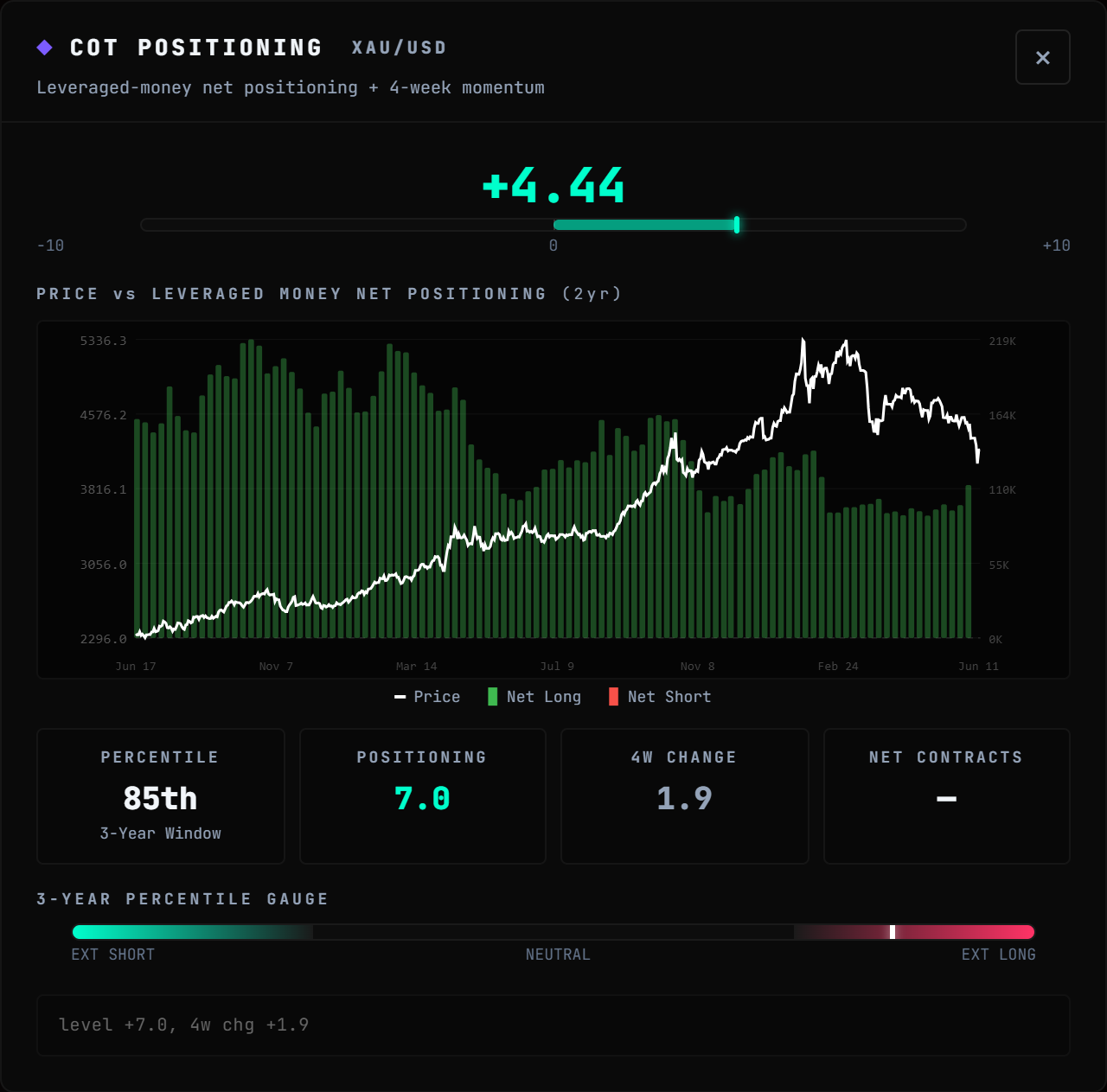
PositioningLIVE
FUNDS
BANKS
RETAIL
Where funds and banks actually sit. Reported, read, scored.
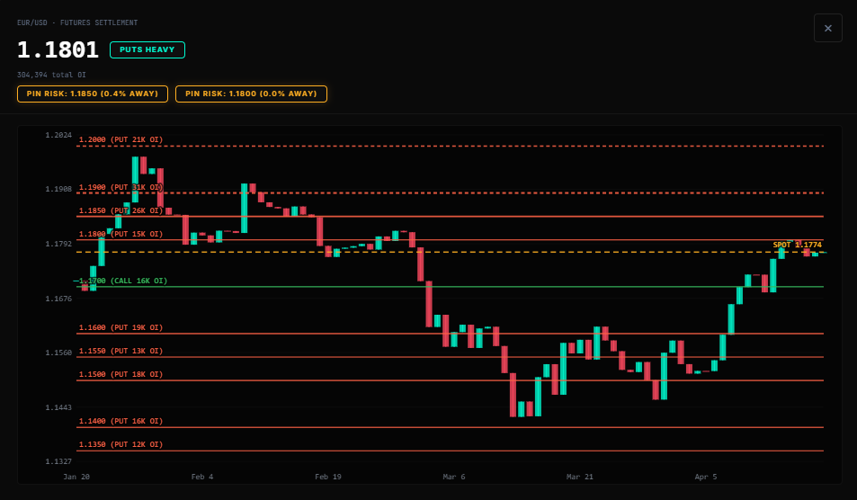
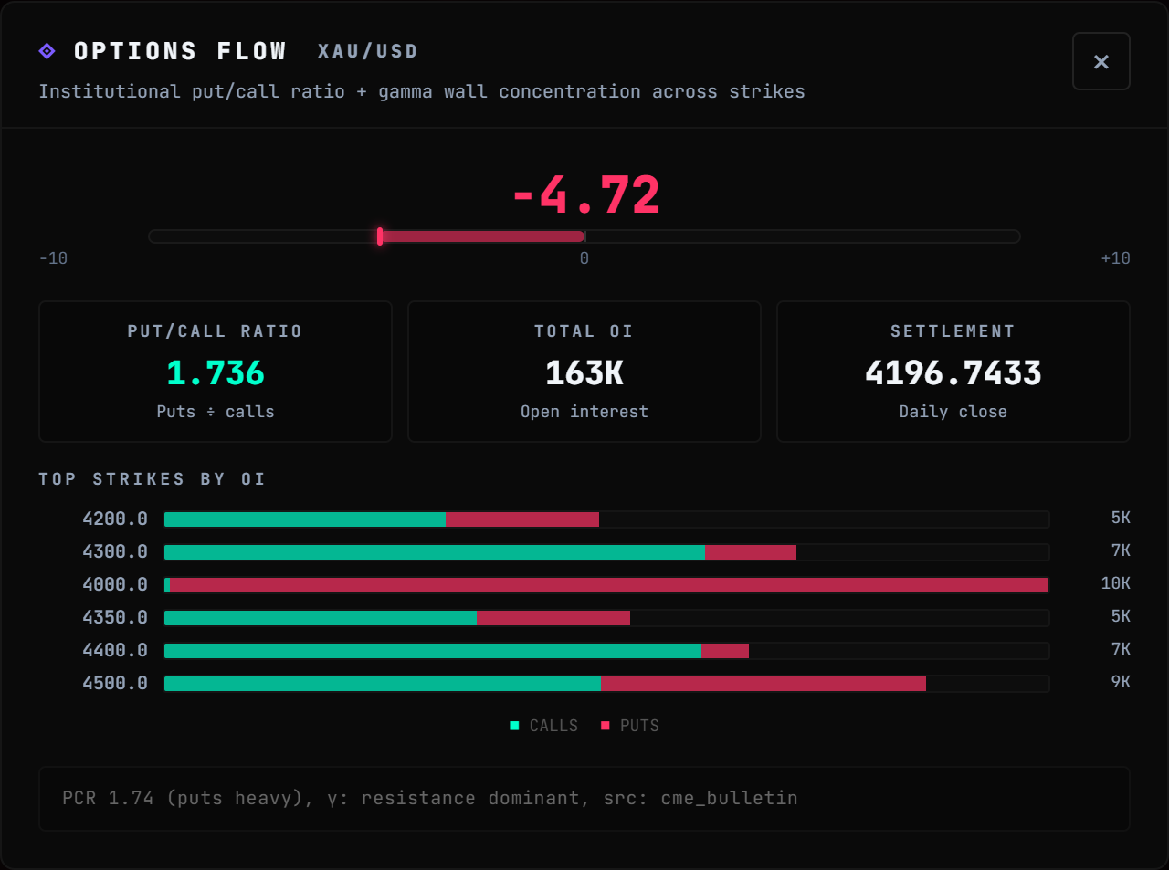
OptionsLIVE
1.18
1.17
1.16
The strikes the desks defend. Walls, magnets, hedges.
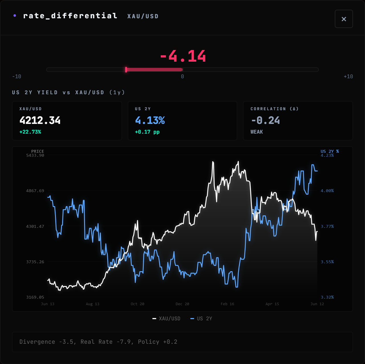
RatesLIVE
GAP
Rates move first. We flag the pairs lagging behind.
One score per pair
+6.4
−100+10
Long, short, or stand aside. When the reads agree, we flag it HIGH.
Inside the app
Six widgets. Zero jargon.
Every pair, every score, every reason. Click anything to go deeper.
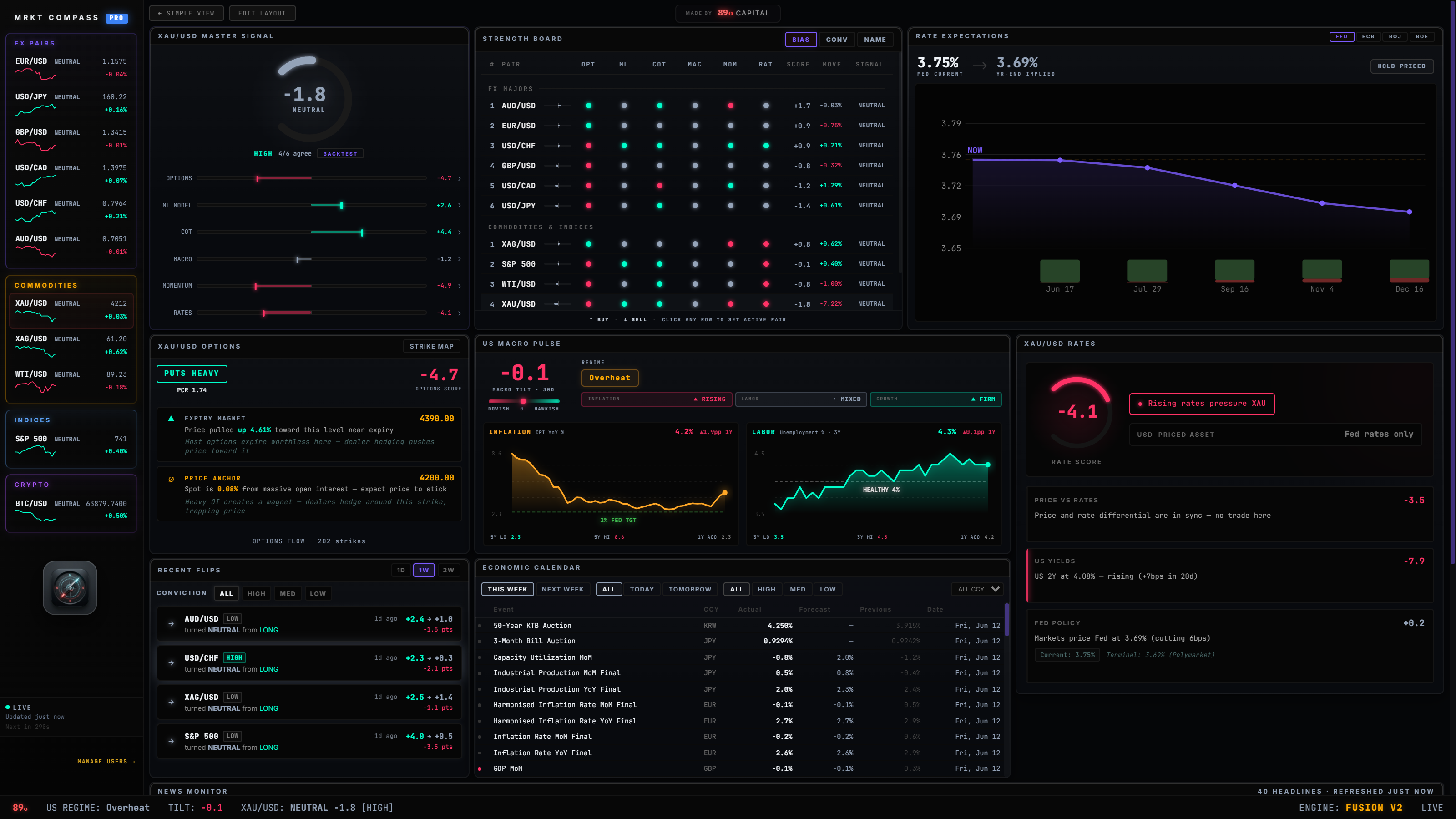
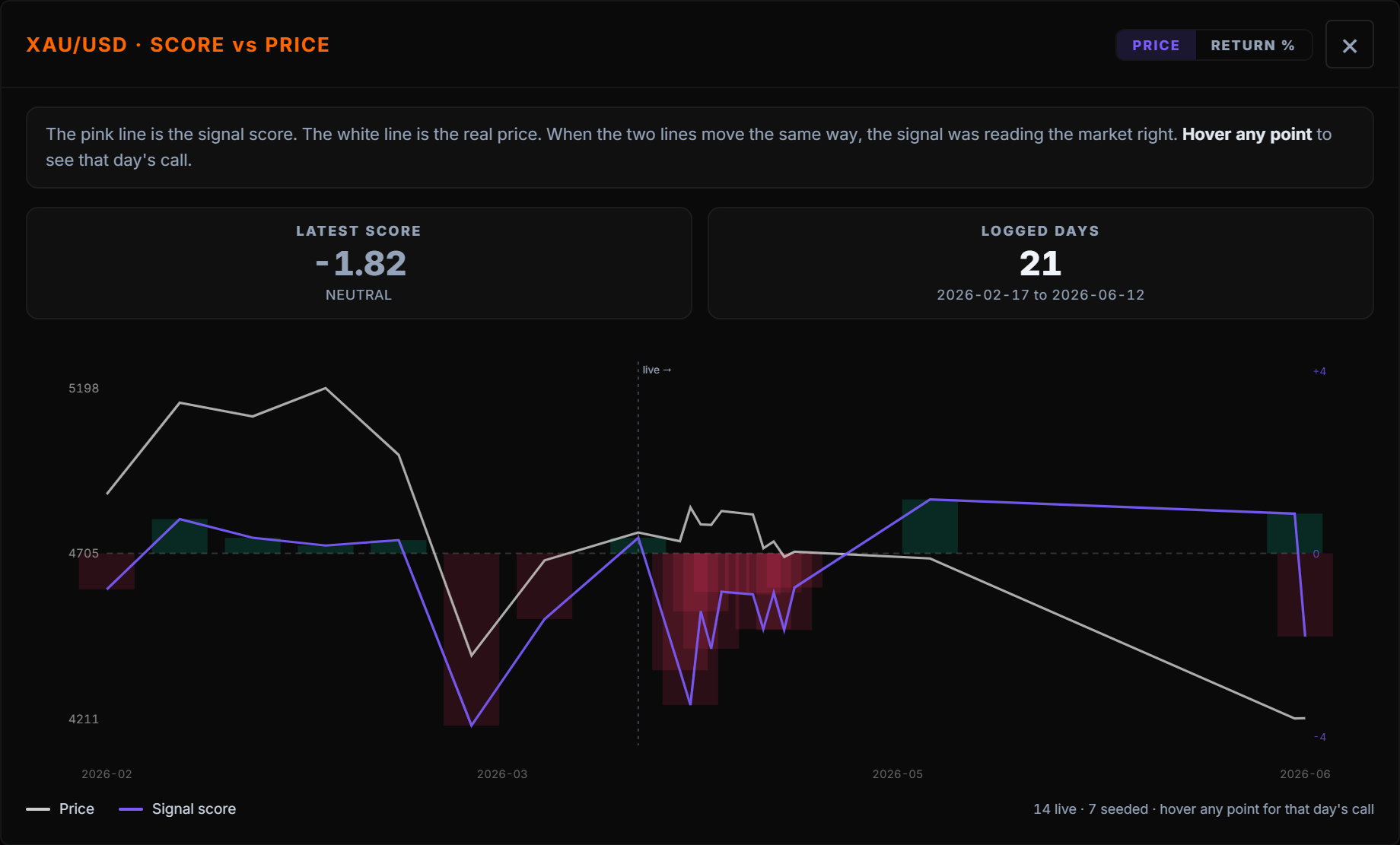
Master Signal
One score. Fully broken down.
The number is the call. The bars show which signals pull long and which pull short. No black box.
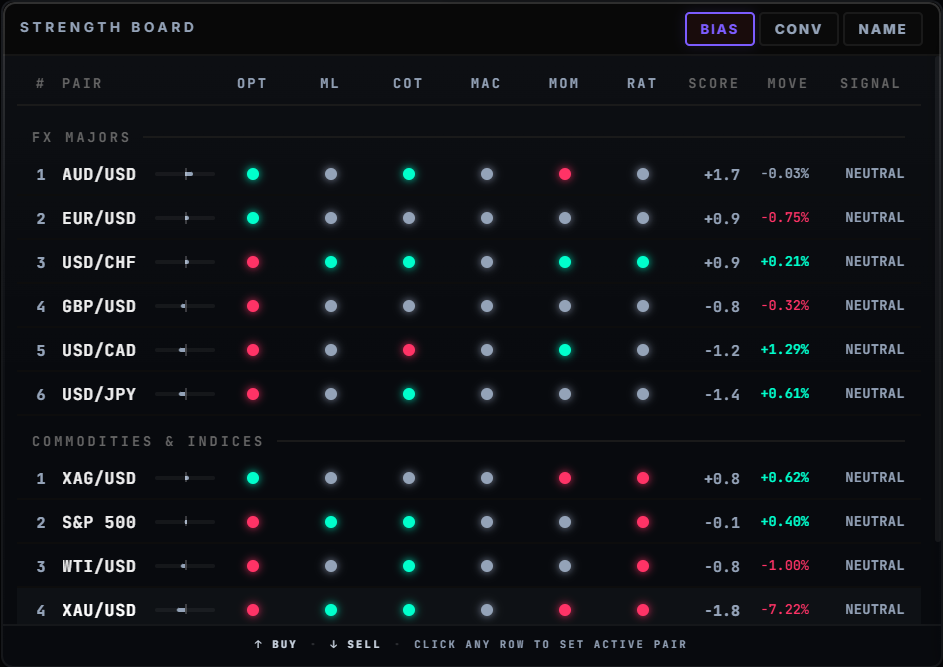
Strength Board
Every pair. Every signal. One grid.
Green means buy pressure. Red means sell. Sorted strongest to weakest. Click a pair to pin it everywhere.
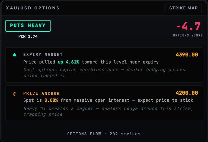
Options Flow
Where the desks are hedging
Live institutional option flow. The strikes the big players defend and the walls that cap the move. Data retail never sees.
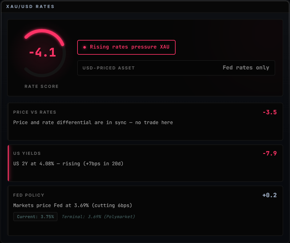
Rate Intelligence
Where rates are pulling currencies
When yields move and price lags behind, we flag it. The fast money takes these setups first.
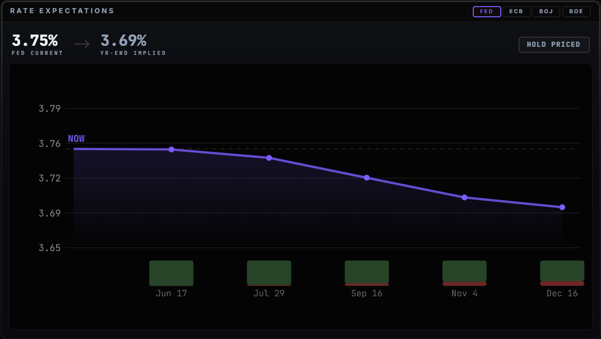
Rate Expectations
What traders think the Fed does next
Live odds on where rates go over the next 12 months. Straight from prediction markets and the yield curve.
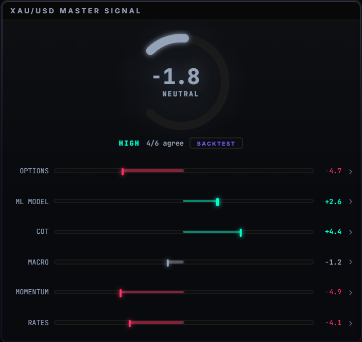
Recent Flips
Be first to the flip
A live feed of every pair changing direction. The moment a market flips is where the edge lives.
Click any signal. See the data behind it.
Every number on the dashboard opens into the full picture.
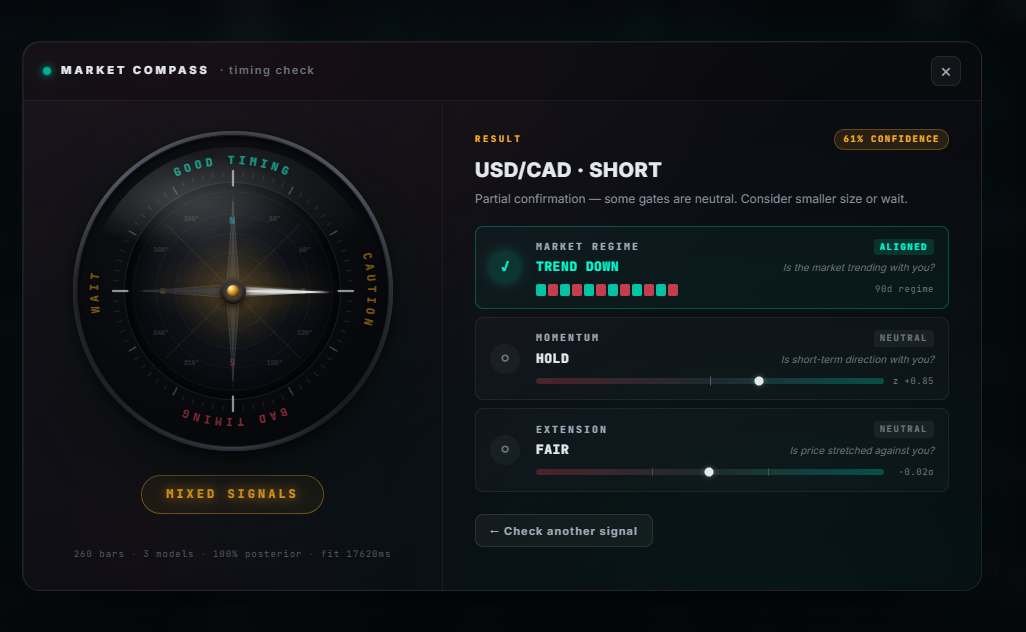
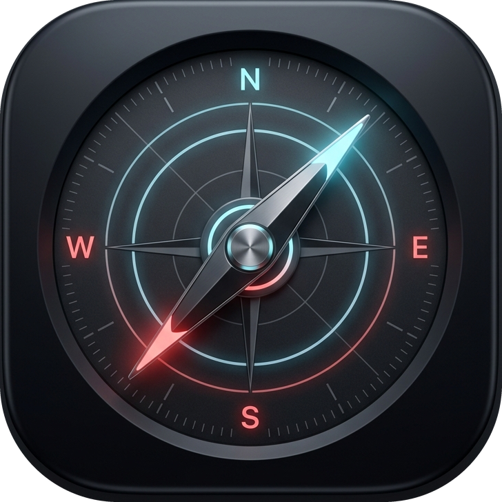
· The timing layer ·
The signal says long. Now should you?
The score gives you direction. The compass tells you if now is the time. Three checks have to agree, or it holds you back. The bad entries you skip are worth more than the good ones you miss.
01
Is the trend really there?Months of price action, read and classified. Going long into a sideways market? The compass holds.
02
Is momentum with you?Your direction has to match where the market is pushing right now, not last week.
03
Has the move already run too far?If price is stretched far beyond trend, the compass refuses. Chasing exhausted moves blows up accounts.
Built by 89σ Capital
One developer. A serious stack.
MRKT Compass is built by one developer who got tired of watching retail traders fly blind. Every model inside was written from scratch, tested on years of real market data, and runs live in production.
Most signal services are spreadsheets dressed up as dashboards. This is real engineering on live institutional data. The same picture funds see every morning, priced for retail.
Join the Discord and DM the operator. We'll set you up within hours.
Questions
Answered straight.
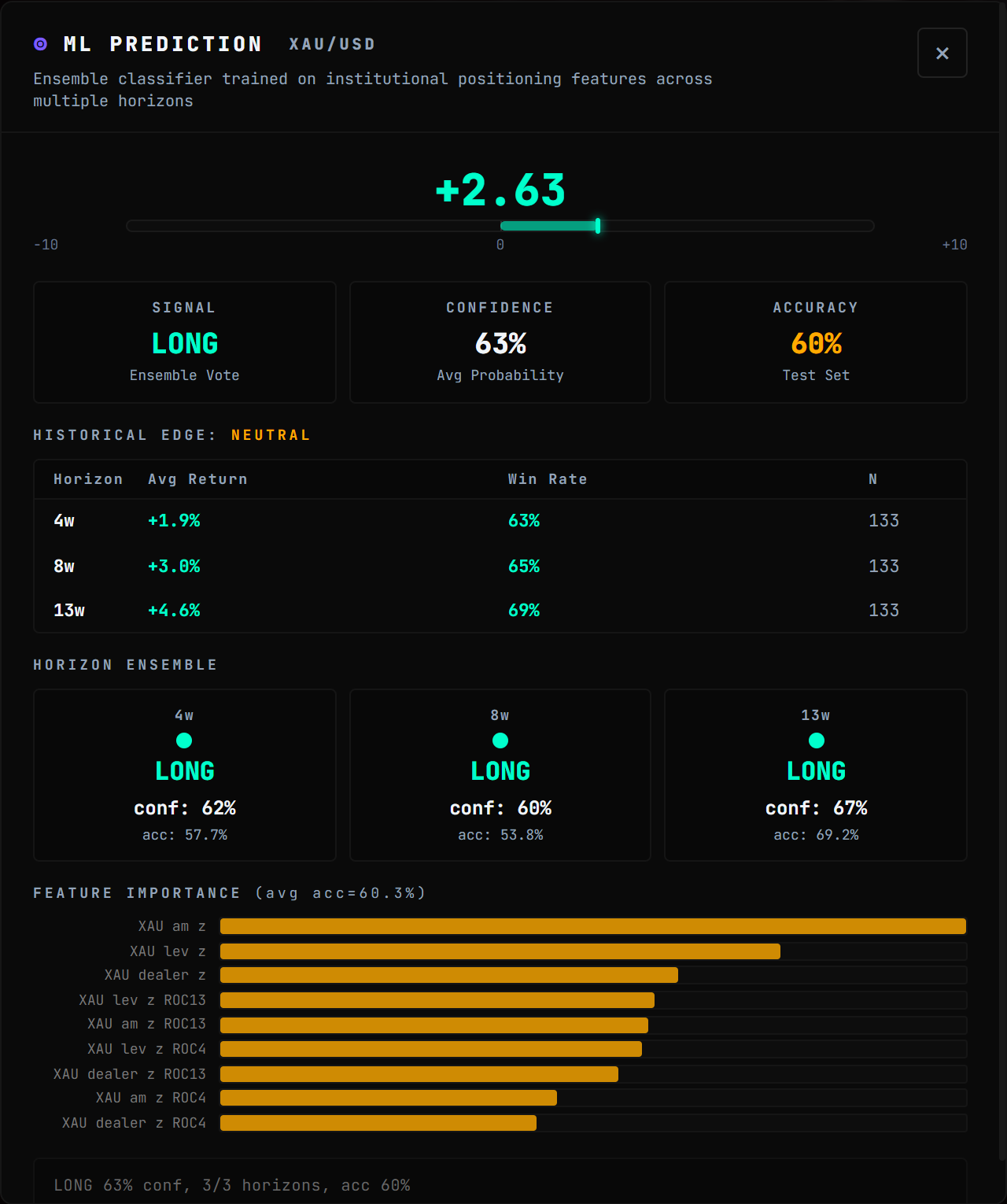
It reads the data institutions trade on and gives you one score per pair: long, short, or stand aside. Open the app, see the call. Five minutes a day.
No. Scores run from −10 (strong sell) to +10 (strong buy). Green means buy pressure, red means sell, near zero means stay out. Want the deep breakdown? Click into it. If not, skip it.
Gurus show their winners and bury their losers. Here every call is on record, scored, and tied to the data that produced it. No cherry-picking.
Twelve live: the FX majors, gold, silver, oil, the S&P 500, and Bitcoin. Trade something else? If the data exists, we can add it.
Prices refresh every few minutes. Positioning refreshes weekly. Macro is scored the moment it drops. When a pair flips direction, you get an alert instantly.
No. This is research tooling. You pick your entries, your size, and your stops. What you get is the information edge the desks have.
Yes. Two clicks from your account. No retention calls. Done.